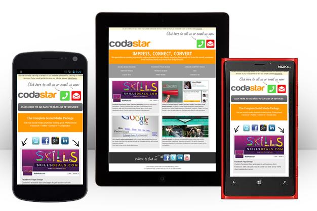
Cross-Platform Web Design
The field of web design has evolved as quickly as the Internet itself. Standards have developed and matured at a rapid pace. In the past, “cross-platform” design meant simply that your website would display correctly on the major web browsers. Today the definition has expanded to reach new levels of accessibility. Web designers are free to experiment with the latest technologies and developments to create stunningly advanced websites.  This experimentation promotes innovative new concepts and ideas, but it also requires a new kind of balancing act as the world of web design has moved far beyond just the major web browsers. Designers now have to account for multiple devices and technologies.
With cross-platform web design, the designer plans and creates a design that displays correctly across multiple platforms. Building accessibility into the design ensures that the more people will be able to properly view the website and interact with it successfully. Also with this type of development, the designer has the ability to make a change or fix that will then be immediately updated across all platforms.
What are some of the ways designers can ensure the websites they create are accessible across multiple platforms?
- Design elements should be consistent and behave in predictable ways. All links should look the same, for example. This helps the users to understand what words are links across the site.
- Include keyboard functionality for users that aren’t using a mouse.
- Give text alternatives for different page elements such as video captions, descriptive alt tags for images, and transcriptions of any audio elements. You can also create different headlines for content to be displayed on different devices.
- Make navigation clear and easy to understand. If you’re using a graphical navigation, provide an alternate for users that can’t access it.
Optimize the design specifically for mobile phones. 63% of adult mobile phone owners use their phones to go online, and 34% of mobile phone Internet users go online only using their cell phone rather than any other device, according to the January 2014 Mobile Technology Fact Sheet. These numbers illustrate how important mobile-responsive design is.
Cross-platform web design allows users to get the same content in beautiful and user-friendly ways. Doing a little extra work during the beginning of the web design process frees up time down the road, which allows the designer to experiment with new design elements or trends. It can also save businesses money as they don’t need to maintain multiple versions of their website or related applications.
To make the most of cross-platform design, designers should focus on simplicity and user experience. Websites should be as accessible as possible to reach optimization across multiple platforms. Simple websites can still be powerful if they give the user the information they need and eliminate any unnecessary hurdles to reach the areas of the website that they need.
Designers should build websites that work on many different platforms but are also straightforward and user-focused. With these principles in mind, designers can create attractive and engaging websites that both work seamlessly across different devices and help users accomplish their goals.
Russel Cooke is a business consultant specializing in Customer Relationship Management. In his free time, he contributes predominantly business-related articles, something he enjoys doing tremendously. You can follow Russel on Twitter @RusselCooke2.
